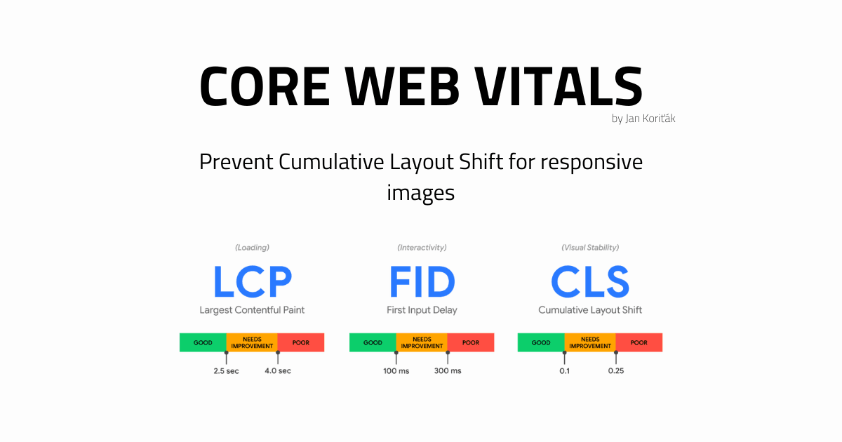
How to prevent Cumulative Layout Shift for responsive images
Core Web Vitals
Hi, I'm Jan. I'm a Tech-Lead @webscopeio and I'm taking a leap into the startup world with hire.dev app.
I spend most of my time in front-end engineering. When I'm not programming, I work on hire.dev app.
I'm active daily on Twitter @jankoritak! See you there!
Are you seeing this message warning in your Lighthouse report?
Image elements do not have explicit width and height.
If you're not sure how to resolve the problem to reduce potential CLS (Cumulative Layout Shift), while staying responsive, keep reading.
TL;DR
Just need to fix the problem fast? That fine! Jump to the conclusion.
The problem
The message is clear.
Lighthouse (or rather Google's Core Web Vital engine) expects you to supply static width and height properties to your img element.
That sounds kind of fishy. We're not in the year 2000 anymore - pages are responsive and dynamic.
Nowadays, image dimensions are commonly defined via CSS, while the above-mentioned HTML attributes are omitted. They're not needed for a responsive image to be laid out as desired. If they are used, they still take lower priority (you'll see why), than CSS-defined dimensions.
Anyway, you can define a responsive image with just a little bit of CSS.
.myImage {
  width: 100%;
  height: auto; // This is a fallback value, but let's be explicit.
}
Done, works like a charm! So what's the problem, Google? Is this really not enough?
It's important to realize, that same as the CSS stylesheets, the images are assets. And assets need to be downloaded in order to be reasoned about and laid out on the webpage.
The browser does not know the dimensions of the image before it downloads its metadata. Therefore, it is not able to determine, what the height: auto; evaluates into.
The interval between the browser not knowing the dimensions of the image and your user skimming over the screen may be relatively short. But there's always a delay.
It's not the year 2000, and you're probably using a CDN, that is serving the assets from the edge. Probably shorter, but still, there is a delay.
This delay causes the CLS - Cumulative Layout Shift, an undesired content jump, that happens right when the browser obtains the image metadata, calculates the height, and renders the image. This content jump will hurt your Core Web Vitals Score and transitively, your SEO.
The solution
Provide the image with responsive styles and an aspect ratio. The browser will figure out the complementary dimension from there (in the case of our example above, the auto height).
Consider the following image element.
<img
  src="../static/hero-image.svg"
  alt="My Site hero image"
  width="1600" <!-- The image_width * n -->
  height="900" <!-- The image_height * n -->
/>
The width and height dimensions are unitless but represent the size in pixels. The dimensions, together represent an aspect ratio of the image.
You can pass any n-multiple of the two numbers, the aspect ratio will stay the same.
aspect_ratio = image_width / image_height // therefore
aspect_ratio = 1600 / 900 = 16/9 = ~1,77
Now, since the browser knows the image width and the aspect-ratio, it can simply count its height.
How does this work?
As said, we're not in the year 2000 anymore, and so are not the modern browsers. There are tons of smart heuristics implemented in the modern User-Agent stylesheets (the browser's default styles or a CSS reset if you will).
The User-Agent stylesheets do consider our case. Except the notorious, I'm sorry IE11.
Here is a section from the relevant part of the HTML specification:
When the text below says that a pair of attributes w and h on an element map to the aspect-ratio property, it means that if the element has both attributes w and h and parsing those attributes' values using the rules for parsing non-negative integers doesn't generate an error for either, then the user agent is expected to use the parsed integers as a presentational hint for the 'aspect-ratio' property of the form auto w / h.
A modern User-Agent stylesheet is therefore expected to implement the following default rule for images.
img {
  aspect-ratio: $img.width / $img.height;
}
There we go, since the browser knows the image's width and aspect-ratio, it can use the trivial equation from above, to count the height.
Since it now has both dimensions of the image, it can reserve an empty box in the layout even before the image asset is downloaded, to prevent the CLS.
Conclusion
Provide the image with both responsive styles and width + height image HTML attributes. Modern browser's User-Agent stylesheets contain default styles that count the image aspect-ratio while respecting your responsive styles.
Your users will thank you and Google will award you some bonus points.